TL;DR: Google's redesigned Antigravity is a single prompt with a folder picker and a model picker. The VS Code-style fork is gone. It now looks exactly like Codex and Claude Desktop — and that's the most honest thing Google could have done.
Open the new Antigravity and there's nothing there.
No file tree. No tabs. No terminal panel pretending to be useful. Just a folder name in the corner, a model picker, and a single text field that says "Ask anything, @ to mention, / for actions."
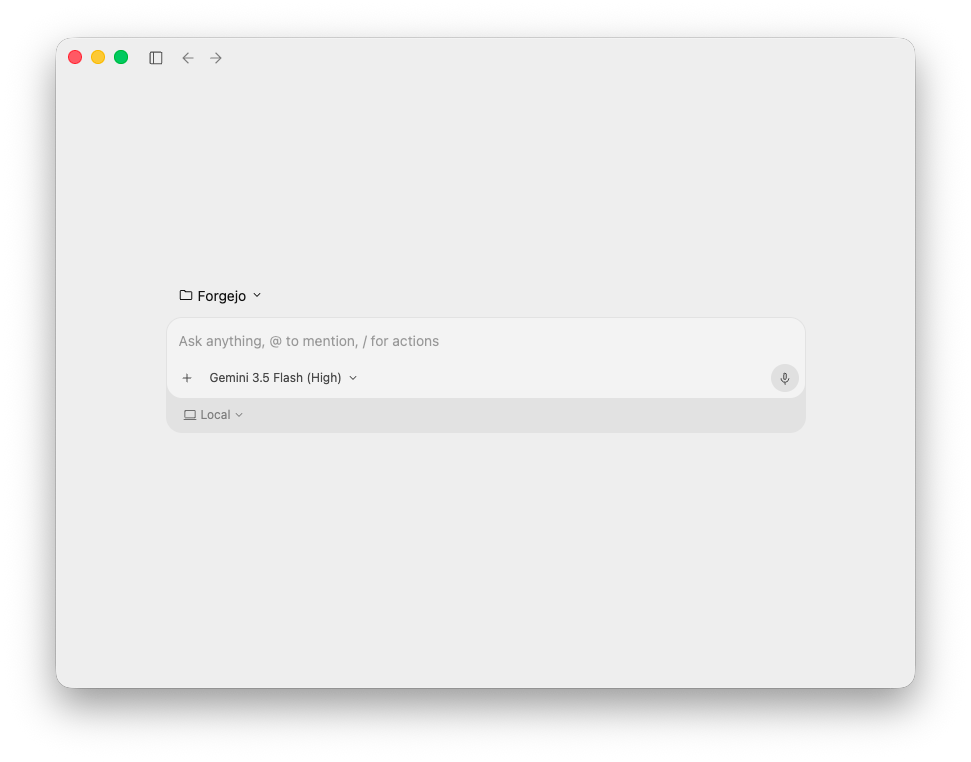
That's the whole product. And it's the right call.
What Antigravity Used to Be
The first Antigravity was a VS Code fork wearing a Gemini sweater. Familiar shell, file tree on the left, tabs across the top, terminal at the bottom, and a chat panel bolted onto the right edge like an afterthought that someone insisted had to be there.
The pitch made sense in 2024: developers live in IDEs, so meet them there. Slot the AI into the same window where they already write code, and you inherit all the muscle memory for free. Cursor proved the shape worked. Why not Google?
The problem was that Antigravity wasn't an IDE. It was an IDE-shaped surface around an agent that wanted to do the work for you. The file tree implied you were going to open files. The terminal implied you were going to type commands. The tabs implied you were going to context-switch. None of that was actually the job anymore. The job was: tell the agent what you want, watch it work, accept or reject.
An IDE optimized for reading and editing is not the right container for that loop. It's a polite costume.
Why a Chat Box Won
Look at what actually shipped and stuck in the last twelve months.
Codex is a chat box with a working directory. Claude Desktop is a chat box with a working directory. Cursor's Composer mode — the part of Cursor people actually rave about — is a chat box that has quietly eaten more and more of the screen with every release. Even the terminal-native tools converged: they're prompts in a folder.
The shape that won is brutally small: prompt + working directory + model. That's it. Everything else is a distraction the agent should be handling on your behalf.
This isn't because UI got lazier. It's because the user's job changed. You're not editing files anymore. You're issuing intent. The file tree is the agent's problem now, not yours — and putting it in front of you implies a level of micro-management that the tool is specifically trying to remove. A blank prompt isn't a missing feature. It's a statement about who's supposed to be doing what.
Google held out longer than most. Now they've stopped holding out.
The Blank Box Isn't Empty
A fair objection at this point: "Sure, but a chat box is just a thinner skin over the same complexity. You haven't simplified anything — you've just moved the dashboard."
That's correct. And it's also the point.
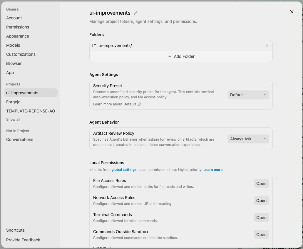
Behind the empty prompt there's a project model, a security preset, an artifact review policy, and four separate permission surfaces — file access, network access, terminal commands, commands outside the sandbox. That's the part you'd be misconfiguring in an IDE-style layout because it would be hiding inside seven menus and a config file. Here it's two clicks deep and labeled in plain English.
So the minimalism isn't laziness. It's a deliberate split: the front door is a single prompt, and the back room is a sandbox you can actually reason about. The IDE-shaped Antigravity was doing the inverse — loud front, fuzzy back. This one inverts the priority, and that's the right inversion for an agentic tool. The thing you need to glance at is "what do I want." The thing you need to read carefully is "what is this allowed to do."
Everyone converging on the chat box is also, quietly, converging on this: serious sandbox semantics behind a near-trivial prompt. That's the actual shape of the category now.
The Honest Concession
Let's name what this redesign actually is: Antigravity now looks like Codex and Claude Desktop. Not "inspired by." Not "in the same spirit as." The same primitive. A window, a folder, a model, a prompt.
That's not a failure of imagination. It's Google admitting the experiment ran and the answer came back. The IDE-fork bet didn't pay off, the chat-box bet did, and at some point you stop defending the bet you lost and ship the one that's working for everyone else.
The interesting question isn't why Google copied. It's how long they waited. A year of shipping an IDE-shaped product while three competitors quietly demonstrated that the IDE wasn't the unit of value anymore. That's the real story here: not the redesign, but the lag before it.
To Google's credit, when the concession came, they didn't half-do it. They didn't keep the file tree "for power users." They didn't leave the terminal as a tab "just in case." They shipped the empty room. That takes more discipline than the original fork did.
What This Means for the Next 12 Months
Three predictions, in increasing order of how confident I am about them.
One: every serious AI coding tool that hasn't already collapsed into this shape will collapse into it. The IDE becomes the fallback surface, not the default. You'll open it when the agent is wrong, not before.
Two: the next round of competitive differentiation is invisible. Once the front door is the same blank box in every product, the fight moves to what happens after you hit enter — memory, tool selection, the agent loop, how gracefully it recovers when it's wrong. Nobody will be able to tell the products apart from a screenshot. They'll only be distinguishable from a transcript.
Three: someone is going to ship something that isn't a chat box and it's going to feel like a revelation. Maybe a voice-first surface. Maybe an inbox metaphor where you queue intents and review results asynchronously. Maybe something we don't have a word for yet. The convergence on the chat box is real, but conventions always invite their own breaking.
For now, though: the blank box is the new starting line. Google just walked up to it.
Good.